Taking Photos
I really love photos that have a certain composition. When photographing people, I like closeups, but I often crop my photos after I take them. As long as they aren't taken from too far away, you can crop using the Edit tool right in the Photos app on your iPhone and not lose too much quality in your photos. I like to take my photos from a medium distance, with some background elements, then crop the photo to my liking after. It gives me more control over what I keep in the photo. Sometimes a lone tree branch or some mountains can add to the story of your photo.
To get clear and bright photos with my iPhone, I do the following: with the camera app open, while I'm taking the photo, I tap the screen on the subject I'm photographing. A little yellow box will appear and focus on the person or item, making them clearer and brighter. Even if the subject is standing in front of a bright light or is backlit by the sun, you can often tap the subject or a darker part of the image, and the camera will readjust for those darker values. This can actually create some neat, glowing effects when the subject is backlit.
Photos taken outside and with bright natural light will, obviously, have the best quality when using the iPhone camera.
When the lighting isn't quite bright enough, even after using these tricks, I use the Afterlight app to brighten them. I use this on almost all my photos unless they're taken in bright sunlight.
Afterlight
 I am head-over-heels in love with this app!
For almost every one of my photos, I use the slider adjustments. This is my routine for most photos:
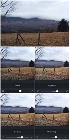
Clarify -- will lighten the darker parts of your image and darken the lighter parts of your image. I do this even on photos of people. At first, it might make the shadows of your images too dark. For example, in the image at right, the tree gets so dark that it almost looks like a black blob. I try to increase the Clarify option until the detail is almost gone. I do this, because I'm going to Brighten the image next.
Brightness -- This lightens the image overall, but (thanks to the Clarify tool) keeps the detail and dark parts of the image clear. The Brightness tool will also wash out parts of your image and reduce the Contrast a bit.
Contrast -- So, then I use Contrast to bring those values back up and create almost an HDR effect -- a dreamy glow around the mountains. As you'll see, at right, the lighter values (the steam and snow) close to the top of the moutain are much brighter, but the top of the mountain stays dark. The clouds are almost washed out but create nice contrast against the dark mountains.
Personally, I like my skies almost completely washed out. It's just an effect I think is somewhat whimsical in certain photos. My college Photography professor sometimes frowned on this (if there was too much cloud loss), but I think it's worth losing a few clouds over, especially if the rest of the photo has nice contrast and especially if this is just for fun, and we're not making print-quality pics!
Sharpening -- If you have a photo that's slightly blurry or just not as crisp due to the fact that it's a digital image, a small amount of Sharpening will really bring out the details.
Facetune
 I wrote a silly post awhile ago (here), detailing how I used Facetune to essentially airbrush myself and fix all my face "mistakes."
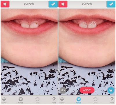
I still occasionally turn to it if I want to smooth some pores or bring out my eyes on a selfie, but I've actually gotten more use out of the Patch tool lately.
I never mind a messy face or a God-given freckle, but the other day I got the sweetest pic of E looking up at me over a bike rack with big, retro sunglasses, and a beautiful smile. Unfortunately, she had a piece of food on her right tooth. I left the gooey food stickiness on her nose and chin, but I really wanted that piece of food gone!
I brought the photo into Facetune, zoomed in, and used the Patch tool to quickly cover it with color values from the other, clean tooth! (See final photo at left below.)
I've also used the Patch tool to remove logos and pieces of lint from clothing, to draw more focus to the photo itself and not some misplaced text or big piece of white fuzz on a black sweater.
Diptic
All of the collages for this post were made with Diptic. It's my favorite, easy-to-use collage app. It provides some basic editing features for any last-minute touch-ups to the image and allows you to create unique collages, edit the aspect ratio, and adjust border size. I've tried a few other collage apps, but this one is still my favorite.
Square-Ready
I use this app only occasionally to make longer or wider photos (and panoramic photos) square, with a black or white border, so that I can post them on Instagram and not crop any of the image.
Over Gram
This app is my favorite for adding text, mainly because I love the fonts it has (used for the "original" and "edited" text on the image below).
Line Camera
This app gives you a little more freedom with adding text (can be rotated, etc.). It has a lot of fonts, but not very many stylized ones. They're similar to the fonts you would find on your computer.
This app also has "Stamps" and some other editing features like drawing tools. I use it to mark up a photo or add hearts, stars, and speech bubbles.


No comments:
Post a Comment